Context
Rentcars.com is a company that works as a search engine and intermediary for car rentals, Rentcars is the largest online car rental platform in Latin America, through the website and app, they provide mobility solutions in more than 160 countries, founded in 2009, They developed a powerful search engine, but the focus on the backend translated into an unsatisfactory user experience, with their first app having been launched in 2017, it left many users frustrated, leading to low ratings in the app stores and constant complaints on TrustPilot .
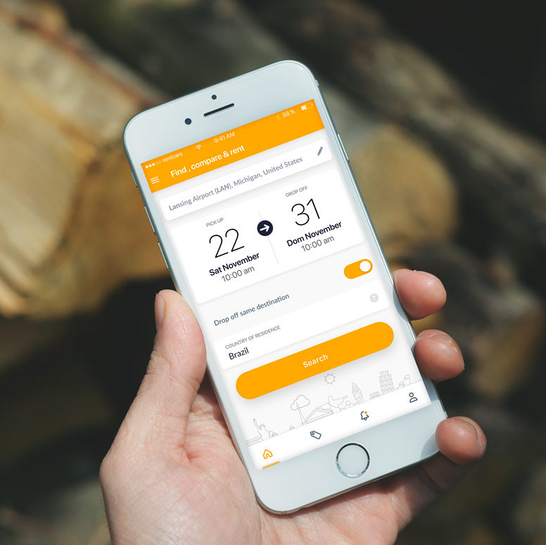
The old app had a very confusing user flow and unnecessary steps, making the process of searching, choosing and making payment long and tedious.

The challenge
I joined the team, being the first and only UX designer on the team, I accepted the challenge of not only creating a unique experience and advocating for the user, but also to create the culture of user-oriented design and also find a team to take care of the entire experience within the company. Thus, having to give workshops to teach the importance of UX experience within the company, and also prove it through interviews with users, reports, A/B testing and bold metrics.
Design Question
“How can we make the process of renting a car as hassle-free as possible, making the user less worried about their dream trip?”
Understanding the user
Firstly, I carried out a study of the users profiles, to better understand their motivations and habits, this way we could understand not only the public in Latin America, but also other potential users around the world.
Several interviews were conducted with users of different profiles, aged between 19 and 60 years, different countries and contact with technologies in different ways.
User profiles
Young people 19 to 25 years old:
Young people with a good understanding of technology, at the beginning of their professional career, looking for convenience and quick, curated and automated information.
Young Adults 25 to 40 years old:
People with a good understanding of technology, looking for more comfort, more customised options, and avoiding mishaps and headaches during the trip, looking for more insurance options and triple A assistance on the road.
Senior adult 40 to 60 years old:
People with a less technology-savvy profile, with a lot of fear and distrust regarding the use of technology, generally tend to use the website as a place to consult relevant information and complete the reservation over the phone.
User personas
With interviews carried out with users, it was possible to convert this learning into personas that synthesize key takeaways into reliable profiles. The personas transformed the entire raw study into accessible models to frame the problems and focus design thinking into a more human experience.


Quantitative data
I collect reviews made by users in the app stores and trust pilot, to understand the user’s biggest pain points and points for improvement.

Worst service ever
Worst service ever. No possibility to change the reservation or add the additional driver.
Svetlana 18 Apr 2019
Dissatisfaction among customers was notorious, users reported basic usability flaws that could be fixed quickly and easily
Those were the three takeaways from the user feedback:
- Essential information was difficult to find: users struggled to locate key details such as required documents for car rental, payment methods, and other critical steps.
- Simple tasks felt unnecessarily complex: actions like selecting extras or upgrading plans required users to go through long, confusing journeys, leading to frustration and drop-offs.
- Lack of clarity in the contract: unclear or overly complex clauses left users confused and frustrated, reducing trust in the service.
Quantitative data
I also analysed the rejection and bounce rates throughout the funnel. and with this I was able to identify and quantify within the sales funnel the critical points that needed urgent improvements.

Dissatisfaction among customers was notorious, users reported basic usability flaws that could be fixed quickly and easily
This shift towards using WordPress block patterns marks a significant movement towards democratizing web design, providing a foundation for addressing the digital divide by making high-quality web design more accessible to first-time developers and small business owners.
Here are three takeaways:
Research Findings
The biggest outcomes collected from this study were:
– 60% of users gave up halfway through.
– 91% of users did not reach the payment page.
– 72% of users found information about rentals, payment methods and car options.
– 47% of users did not understand very well how car insurance worked.
– 38% Did not understand what documents were needed to rent a car.
Crafting the user journey
Analysing the user flow
With all the information collected about the user, I were able to identify not only the user’s biggest pain points, but also the areas within the user journey that needed more attention, so the next step was to analyse the user flow in more detail and understand how could it be improved.
The current journey, from the user’s first contact with the app, to finalising a car reservation, in total took 11 steps, a long journey that required patience and persistence from the user

The current purchase funnel was confusing and long to complete the purchase, taking an average of 25 minutes to complete the car rental, with a total of 11 steps from search to completion of payment, users giving up halfway through.
Analysing the user flow
The new proposal for the user flow consisted primarily of eliminating intermediate sessions with information that we identified as not relevant to the user during the user testing sessions, and grouping areas in common context, such as reviewing with the Ux writing team improvements throughout the copy
This resulted in a user flow where from search to purchase confirmation in just 5 steps.


I also did analysis and curation work on the user’s biggest pain points contained in the chat and helpdesk, so that I could also know how the content was being received by the user.
We completely rewrote the content of the internal pages to better describe rates, insurance, and information relevant to car rental.
Results & outcomes
After the app was launched, I continued monitoring the app’s data: Reviews, Complaints, rejection and conversion rates


App review
After 1 month of the launch of the application, a significant evolution was noticed in the app store ratings, the App, which previously had a very low rating of 3.4 stars, went up to 4.6 stars in reviews on Apple store, and to 4.0 on Google Play store, surpassing our biggest competitor.
Learnings
After 6 months of hard work, it was a very positive experience to see the impact that focus on the user had not only on the end user, but on the entire company culture, I felt that the change was significant not only in revenue or reviews, but also in transformation of the company, teams focusing on double diamond, continuous improvements, and the transformation from delivery to just features, the mentality changed to delivering value.


